This independent research study examined how new gamers navigate the PlayStation 5’s icon-based menu, using mixed methods to identify design gaps in labeling and feature grouping, and providing data-driven recommendations to improve clarity and usability for novice users.


Introduction
This independent research study that evaluated the information architecture (IA) and technical communication of the PlayStation 5’s icon-based menu for new gamers. Using a mixed-methods approach – including a two-part closed card sort and a thematic analysis – the study assessed how novice users interpret and navigate the system’s iconography and labels. The goal was to identify disconnects between users’ mental models and the console’s menu design, in order to improve overall user experience and reduce cognitive friction. By comparing how participants sorted features by text versus by icon, the research revealed where the PS5’s interface fails to communicate effectively to first-time players.
The problem
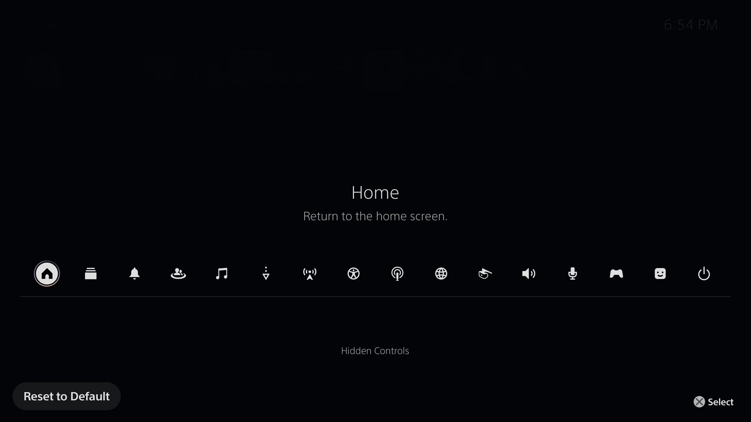
Novice gamers – defined as users with minimal prior experience in modern console interfaces – consistently struggled to locate functions within the PS5’s menu. Primary challenges stemmed from semantic ambiguities in icon interpretation and a lack of clear conceptual grouping for social features. In particular, participants found terms like “Game Base” and “Switcher” unclear, and they weren’t sure what kinds of features those labels represented. Likewise, several icons were confusing or visually interchangeable. For example, icons for Broadcast, Network, Voice, Mic, and Sound all use similar wave or signal imagery, leading one participant to remark: “The Broadcast icon and the Network (or maybe Voice) icon felt interchangeable to me… they all had that kind of signal or wave imagery”. Similarly, the PS5 splits audio controls into separate Sound, Voice, and Mic menus, which novices often mixed up due to overlapping functions (e.g. not knowing where “mute” or volume settings belong). These issues indicate that the menu’s current organization does not align well with how new users naturally think about the console’s features, especially for social interactions (friends, parties) and system tools (network settings, multitasking), causing confusion and hesitation in navigation.
The solution
Based on the research findings, a series of evidence-backed improvements were proposed to enhance the menu’s usability and semantic clarity. The solutions focused on redesigning ambiguous icons and relabeling key menu items to better match user expectations. For instance, the study recommended rebranding “Game Base” to a more intuitive term (such as a “Friends Hub” or “Social Center”) and revising its iconography to clearly represent social or interpersonal communication. This change would leverage common mental models (many apps use a friends or community icon) and help users immediately recognize where to find friend lists, party chats, and other social features. For highly confusing features like “Switcher,” the solution was to rename it to something clearer (e.g. “Recent Apps” or “Quick Switch”) and redesign its icon to evoke the concept of multi-tasking or recent activity. By introducing familiar visual metaphors (such as overlapping arrows forming a circle for switching) and possibly adding a brief tooltip (e.g. “Quickly switch between your recent games or apps”), the Switcher feature would become much more self-evident to new users. Overall, each recommendation aimed to realign the PS5 menu’s structure and terminology with user mental models, thereby reducing cognitive load and improving findability for novice gamers.
The outcome
The study identified several critical usability concerns for new users and provided a clear framework for improving the PS5 menu’s clarity and navigability. The research confirmed that while certain universal symbols (for example, the power symbol for Power, or the house icon for Home) were immediately understood by most participants, many of the system’s other labels and icons suffered from a misalignment with user expectations. In particular, features related to social interaction and system navigation were problematic: participants had no obvious place to look for friends or party invites due to the absence of a dedicated social category, and functions like the Switcher were not discoverable without prior knowledge. By using a mixed-methods approach (quantitative accuracy measurements coupled with qualitative feedback), the study was able to pinpoint specific breakdowns in the interface and generate empirically backed solutions to address them. The outcome underscores the value of user research in diagnosing interface issues – the evidence-based recommendations arising from this project can lead to a more inclusive and intuitive gaming experience for all players, especially those new to the PlayStation ecosystem.
Redesign recommendations
Based on findings from my research study (2025), I developed the following recommendations for redesigning the PS5 menu icons. These redesigns are grounded in data from a mixed-methods card-sorting study with novice users, aimed at improving semantic clarity, reducing cognitive load, and aligning the iconography with user mental models. Notably, participants in the study correctly matched only about 56–75% of the icons to their intended menu categories on average, illustrating the need for clearer iconography and labels.
1. Switcher
Reason for Redesign: The current Switcher icon (two overlapping rectangles) failed to effectively communicate its function of quickly toggling between recent games and apps. Participants consistently showed confusion about this icon’s meaning – one even asked, “I don’t know what Switcher means. Switch what? Games? Profiles?”. In the card-sorting task, the Switcher icon was among the most frequently misclassified items, sometimes guessed to belong under unrelated sections, which led to one of the lowest accuracy rates for any menu icon. This ambiguity indicates that both the label “Switcher” and its visual metaphor are too opaque for users unfamiliar with PlayStation’s terminology.
Recommendation: Rename and redesign Switcher to make its purpose obvious. The research report suggests using a more descriptive label like “Recent Activity” or “Quick Switch,” which immediately hints at its function. Visually, the icon should be revised to better evoke the concept of multitasking or recent activity – for example, using a symbol of two arrows forming a circle (indicating switching) or stacked windows/screens. These changes would leverage familiar conventions so that even first-time users can infer the feature’s use. Additionally, providing a short on-screen description or tooltip the first time a new user opens this menu (e.g. “Quickly switch between your recent games or apps”) was recommended to reinforce the feature’s meaning. By improving both naming and imagery, the Switcher functionality would become much more discoverable and intuitive to novices.

2. Game Base
Reason for Redesign: The Game Base menu (labeled with an icon of two human figures) caused significant cognitive dissonance for participants. Many users did not understand what “Game Base” meant at all, and those who tried to guess often failed to associate it with the console’s social features. In practice, Game Base on the PS5 is intended as a hub for friends, parties, and multiplayer activity – but neither the term nor its iconography communicated a “social hub” to new players. As a result, social functions like friend lists and party chats were frequently miscategorized under other menus (e.g. Profile or Network), because Game Base did not cue users that “this is where social features live”. This was a major point of confusion: participants often hesitated or searched in the wrong places for anything to do with friends or online play, highlighting a disconnect between the menu’s labeling and user mental models.
Recommendation: Rebrand Game Base to a more intuitive and transparent social hub label, and update its iconography to match. For example, my report recommends using a title like “Friends & Parties” or simply “Social” – terms that directly reflect the content and would align with what users expect to see for community features. The icon should likewise be changed to an unmistakable social symbol, such as a group of people or chat bubbles connected together. This leverages common UI conventions (many apps indicate friend or community sections with people icons) so that even a novice immediately recognizes the category. With a clearer label and icon, new users would no longer overlook the Game Base menu; instead, they would understand at a glance that this is where friends, messaging, and parties are managed. Implementing this change would drastically reduce the current cognitive gap – in other words, users wouldn’t be left wondering what “Game Base” means, because it would be explicitly presented as the Social or Friends section of the menu.

3. Downloads/Uploads
Reason for Redesign: Participants struggled to interpret the Downloads/Uploads icon (typically shown as a downward arrow, sometimes paired with an upward arrow). Novice users often confused this symbol with other system functions like Save, Install, or general system updates. This confusion likely arises from the overuse of arrow icons in digital interfaces – a single down-arrow without context is a very generic metaphor that could mean “download,” “save,” or even just a downward navigation. In the PS5 menu, the issue was compounded by the terminology; the console sometimes uses the word “Copies” in this context, which left users puzzled as to what was being copied or transferred. As a result, the Downloads/Uploads section was another common point of misclassification in the study, indicating that its current icon and label are not conveying the intended meaning clearly to new users.
Recommendation: Design a more explicit icon (and possibly adjust the labeling) for Downloads/Uploads to differentiate it from other system actions. The study suggests using a combined icon that shows both directions of data transfer – for example, two arrows (one pointing down, one up) over a file tray or drive symbol. This kind of double-arrow imagery is a common, well-understood metaphor in PC interfaces for download/upload management and would likely be clearer than the current minimalist arrow. In addition, the label “Downloads/Uploads” should remain visible (or even be supplemented with a more user-friendly term like “Transfers”) so that users have textual confirmation of the icon’s meaning. The key is to provide enough context in the icon itself — even at the cost of slightly more visual detail — to ensure it isn’t mistaken for a generic save or network icon. By adopting a more descriptive symbol and terminology, the PS5 can help users quickly recognize this menu as the place to manage file transfers (game downloads and uploads), thus reducing the ambiguity caused by the current arrow icon.

4. Broadcast
Reason for Redesign: The Broadcast function (used for live-streaming gameplay) is represented by an icon with radiating waves, which proved highly unintuitive for new gamers. Participants frequently misinterpreted this symbol – some thought it had to do with audio volume or a wireless signal, and few immediately connected it with streaming or sharing gameplay. The lack of a universally recognized metaphor for “broadcasting your gameplay” means that novice users often aren’t even thinking about live-streaming as a possibility, so an abstract icon of radio waves failed to trigger the correct association. In the study, the Broadcast icon was one of the most commonly misunderstood icons (often confused with sound or network-related icons), which indicates that the current design does not effectively communicate its purpose to the target audience.
Recommendation: Redesign the Broadcast icon to more explicitly convey the concept of live streaming, and provide better cues for first-time users. A more literal representation could work much better here – for example, using a video camera symbol or a screen with a “LIVE” badge on it. Another idea is incorporating a red dot (the universal indicator for recording or live status) alongside a play or video icon. Such imagery taps into familiar visual language (camera = video, red dot = recording) that even non-streamers would recognize, unlike the current radio-wave symbol. The label “Broadcast” itself is succinct and can be kept, but pairing it with an improved icon (and perhaps renaming it to “Broadcast/Live” in tooltips) will bridge the comprehension gap. The study also recommended adding a one-time onboarding hint – for instance, when a user first highlights this icon, a subtitle could appear saying “Broadcast – stream your gameplay live”. This brief explanation would educate novices about a feature they might not initially understand. By making the iconography more concrete and augmenting it with a short description, the Broadcast feature would become more accessible, preventing users from confusing it with unrelated functions and helping those interested in streaming to find it easily.

5. Network
Reason for Redesign: The Network category (indicated by a Wi-Fi signal bars icon) introduced semantic ambiguity for participants. Some users correctly interpreted the icon as relating to Wi-Fi or internet settings, but the label “Network” caused others to wonder if it referred to a social network (friends, online community) rather than console connectivity. In other words, the term “network” was too broad – novices weren’t sure if this menu was about their **network **connections or their network of friends, especially since the PS5’s social features were not clearly labeled elsewhere. The icon by itself (wireless signal bars) was a clue towards internet settings for a few users, but not all novices made that leap, and some thought it might be a generic connectivity or even a broadcasting symbol. This confusion underscored that the Network menu’s naming and iconography weren’t sufficiently distinct from social-related concepts, making it another area where mental models and menu design diverged.
Recommendation: Disambiguate the Network menu by renaming it and tweaking its icon to clearly indicate internet connectivity settings (as opposed to anything social). For example, changing the label to something like “Network Settings,” “Wi-Fi & Connectivity,” or simply “Internet” would immediately clarify that this is about technical network connections. Accompanying this with an updated icon could further reduce confusion: the Wi-Fi bars symbol is fine, but it could be augmented with a familiar emblem like a globe or a gear (settings) icon to reinforce the idea of online connectivity settings. These changes follow the principle of semantic transparency – the menu name and icon should together communicate exactly what the user will find inside. By making the Network menu explicitly about internet/Wi-Fi configuration, users won’t mistakenly think it has to do with friends or social networking. This clarification also complements the earlier recommendation to introduce a dedicated Social/Friends section: with a true social hub in place, the term “Network” can safely be repurposed (or specified) to strictly mean system connectivity, and novices will understand both sections without ambiguity.

6. Playstation VR
Reason for Redesign: The current PlayStation VR icon, which features a simplified headset silhouette, was frequently misunderstood or overlooked by participants in the study. While some recognized it as headgear, others mistook it for a controller, camera, or even an audio device. The minimalist form fails to clearly signify virtual reality, especially to users unfamiliar with VR equipment. Additionally, the icon lacks context or depth—novice users found it difficult to associate it with immersive gameplay or a digital environment. In the card sorting study, this led to frequent misplacement or hesitation, undermining both discoverability and semantic clarity.
Redesign Recommendation: To improve recognition, the icon should be redesigned with stronger affordances that visually communicate virtual reality. This might include incorporating a more detailed headset form with distinct lenses, or surrounding the icon with subtle environmental elements like a horizon line or grid—symbols that evoke a virtual world. A white-on-black iconography should be retained for visual consistency, but the imagery should shift from abstract to concrete. Using a VR headset that includes "screen" or "immersive field" cues would help users immediately associate the feature with immersive gameplay. This aligns with findings from the report, which emphasized the need for more semantically transparent icons that support novice user mental models.

Summary of Findings
This study found that while universally recognized icons (such as Power, Home, the Notifications “bell”) performed well with new users, icons relying on non-literal or PlayStation-specific metaphors led to significantly lower comprehension. Participants overwhelmingly identified icons that followed well-known conventions, but were left guessing when an icon was too abstract or branded (for example, Switcher or Game Base). The quantitative results reinforced this: in the card sort, icons were more challenging to sort correctly than text labels, with participants on average matching only ~56–75% of icons to the right menu (versus ~60–70% accuracy for text-based feature sorting). In practical terms, this means the visual design of the menu was imposing a higher cognitive load on novices – several users expressed that many icons “all look the same after a while,” illustrating the difficulty in distinguishing their meanings without clearer cues. Redesigning the problematic icons and labels based on principles of semantic clarity and familiar metaphors is expected to greatly enhance the PS5 menu’s overall usability and learnability for new gamers. By aligning the interface with users’ existing mental models and expectations (and providing supportive cues where needed), the system can reduce confusion, speed up feature discovery, and provide a more welcoming experience to those who are not yet fluent in PlayStation’s interface language.