I led the end-to-end content design and accessibility strategy for the Online Help Feature Buttons, collaborating across Documentation, UX, Development, and Localization to create a multilingual, user-friendly navigation experience for users in our Online Help.
Overview
I led the end-to-end content design, copy strategy, and accessibility integration for the Online Help Feature Buttons located in Informatica’s Online Help. The project introduced interactive buttons that let users instantly jump to the information they need within long help pages, transforming static documentation into a more guided, task-focused experience. Each button was designed with contextual, action-oriented copy to serve as both a navigational aid and a clear content hook, improving usability, accessibility, and multilingual consistency across global documentation.
The Problem
Informatica’s online help system contained long, text-heavy pages that were difficult to scan and navigate.
Key challenges included:
Users struggled to locate relevant content efficiently on lengthy pages.
Traditional text links lacked visual hierarchy and contextual clarity.
Inconsistent button text length caused layout instability and translation issues.
Accessibility standards required full ARIA, keyboard, and screen-reader compliance.
Goals
To address these challenges, the project aimed to:
Improve navigation on long online help pages with interactive, context-rich buttons.
Create visually prominent, user-friendly elements that guide readers intuitively.
Enforce consistent copy length and structure to support multilingual translation.
Achieve full accessibility compliance across all assistive technologies.
Approach & Strategy
I collaborated closely with multiple stakeholders to ensure the solution was scalable, maintainable, and user-centric.
Cross-functional collaboration: Partnered with Documentation, Dev, UX, Accessibility, and Localization teams to align design, function, and compliance.
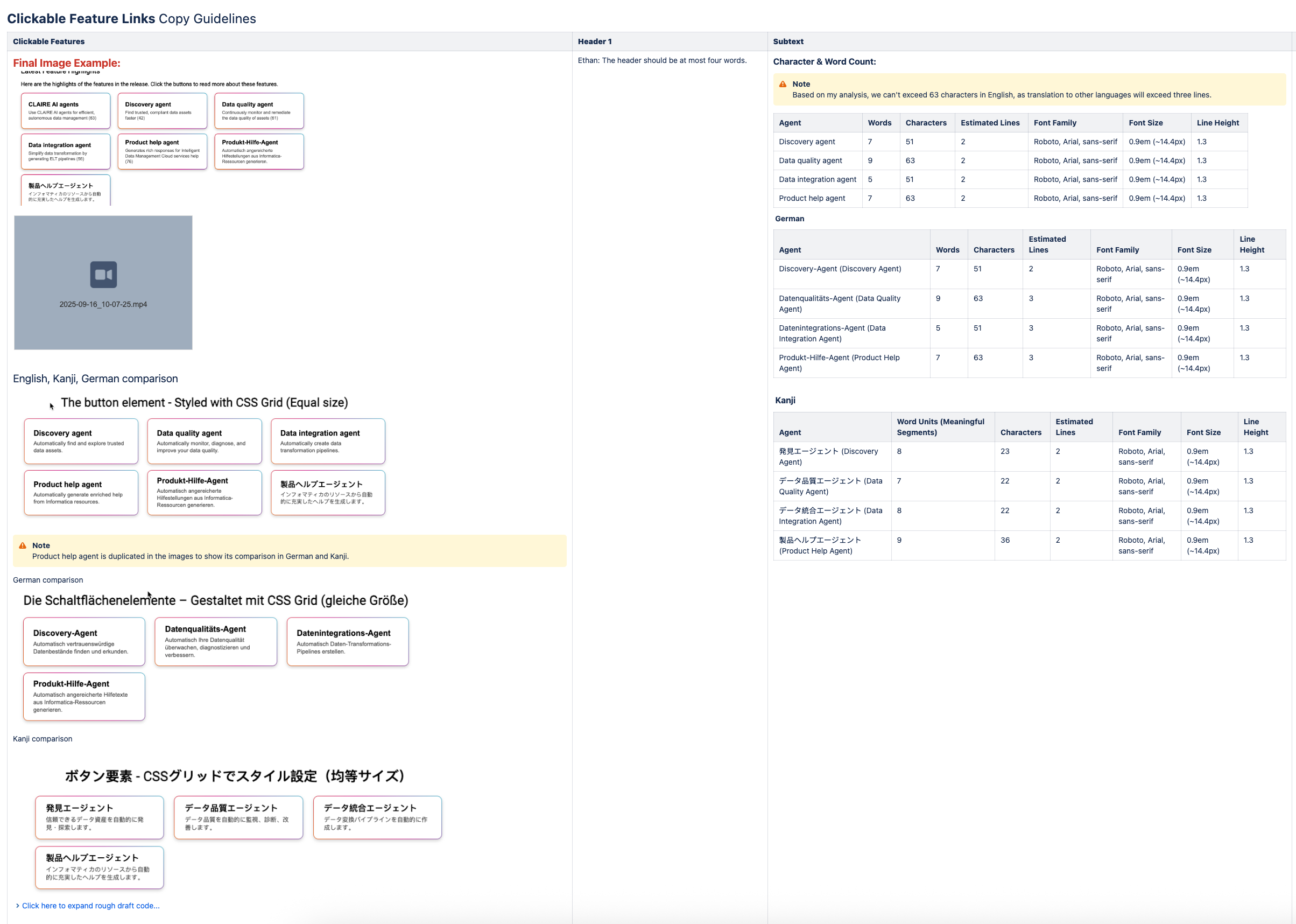
Copy guidelines: Defined strict character limits and tone rules to ensure layout stability and translation accuracy.
Accessibility integration: Implemented ARIA labels, keyboard navigation, and screen-reader support within Oxygen XML.
Low-maintenance design: Structured the solution to minimize authoring complexity and support long-term sustainability.
Enablement: Planned internal demos and authoring trainings before launch to promote adoption.
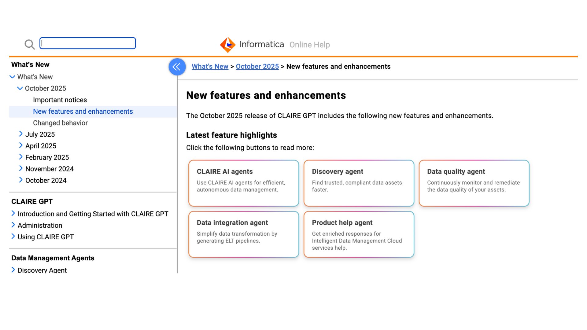
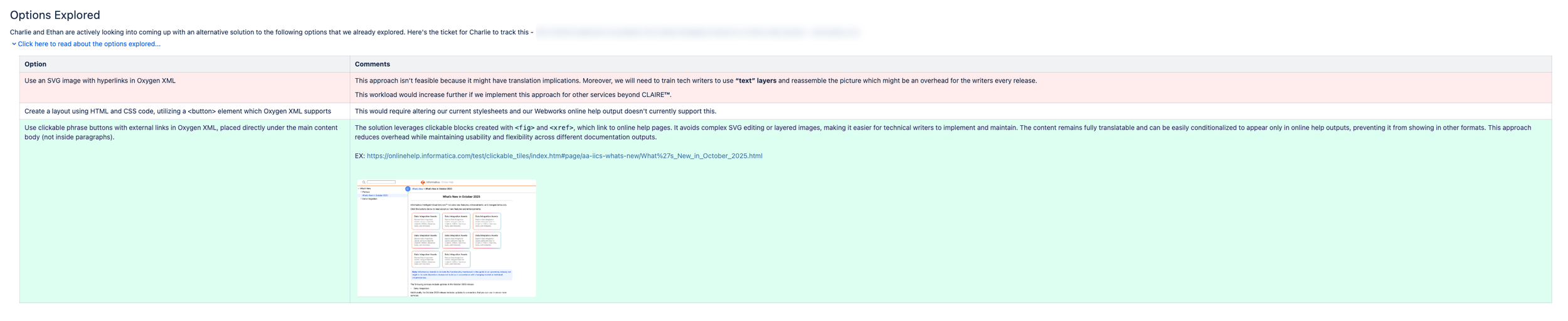
The options explored are shown in the following image:
Feedback & Iteration
Throughout the process, I gathered iterative feedback from Localization, Documentation, UX, and Product Management teams.
Refined copy for clarity, translation friendliness, and brand tone alignment.
Enhanced accessibility compliance through repeated QA testing and ARIA validation.
Conducted design reviews to improve usability and authoring workflows.
Updated documentation templates and style guides based on stakeholder insights.
One sample of then revisions are shown in the following image:

Implementation & Collaboration
Once the final copy and design were approved by Engineering, UX, and my Senior Director of Documentation, I partnered with the Localization Team to ensure multilingual consistency.
We finalized button lengths, character counts, and UI alignment across multiple language versions, guaranteeing a clean, accessible presentation in every translation.
Next Steps & Sustainability
To ensure long-term scalability, I developed and implemented several follow-up initiatives:
Completed: Final integration of clickable feature tiles into Oxygen XML outputs.
Completed: Development of a detailed UX Writing Style Guide for future releases.
Completed: Training technical writers on XML class usage and standardized templates.
Completed: Creation of supporting materials such as PowerPoint workflow guides for internal teams.
Completed: Presenting the solution at upcoming Documentation All-Hands to encourage adoption.
Completed: Conducting post-release user research (surveys, interviews, analytics) to measure usability and engagement.
Through cross-functional collaboration with Product Managers and the direct user research PMs conducted, we confirmed that the new menu and content design significantly improved navigation efficiency, resulting in a seamless and highly intuitive Online Help experience.
Project Roles:
Content Designer
UX Designer