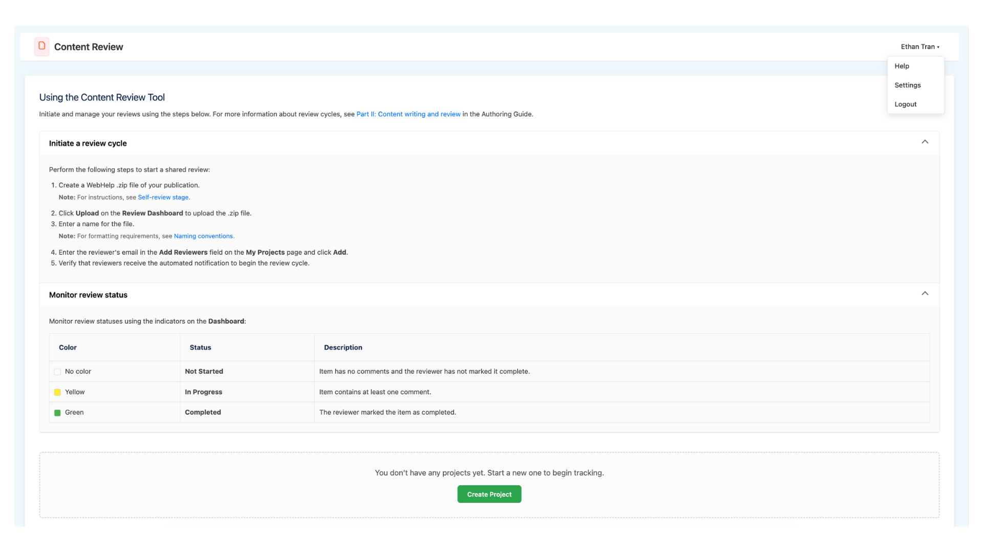
I led the content design and technical writing for the Content Review tool’s Help Center, collaborating with engineers to transform complex review workflows across the R&D Products department into a scannable, action-oriented support experience within our global Content Review tool. I structured the information architecture using collapsible components and clear status indicators to reduce user friction during the documentation review cycle.
Overview
I led the content design for the Content Review tool’s Help Center, transforming complex workflows into a guided, task-focused experience within the UI. I replaced dense, passive documentation with scannable, active-voice instructions and a centralized support interface. My solution implemented collapsible components for on-demand help, visual status indicators for clarity, and proactive "empty state" messaging to guide users through the documentation review cycle with minimal friction.
The Problem
The Content Review tool lacked a clear support structure, forcing users to navigate complex documentation workflows without intuitive guidance. Key challenges included:
Low scannability: It was difficult for authors and reviewers to locate specific steps quickly.
Lack of visual feedback: Users struggled to interpret the dashboard's color-coded system without a centralized key.
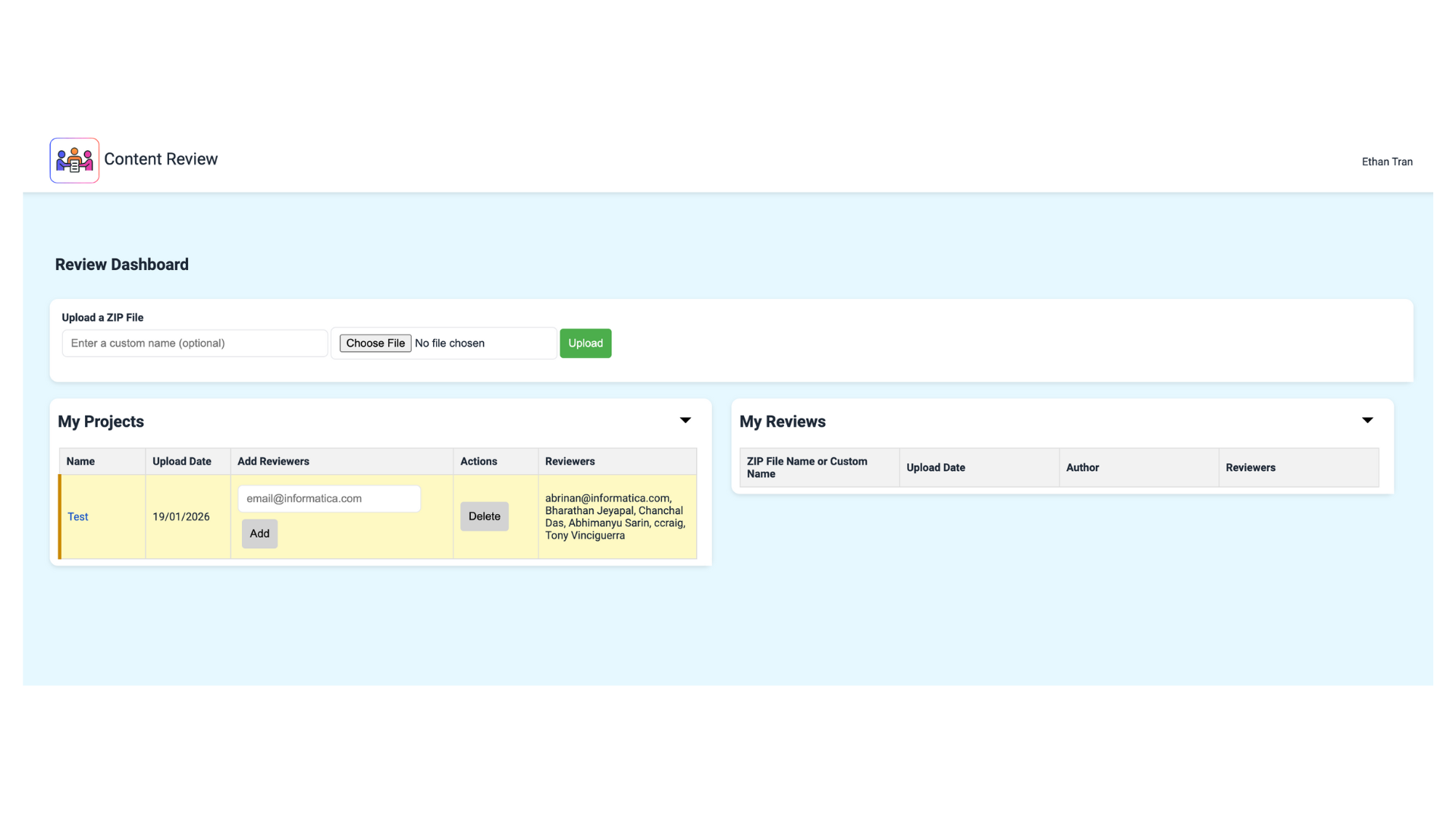
Friction in first-time use: A lack of proactive "empty state" guidance led to user drop-off when no projects were present.
Disjointed documentation: Crucial naming and formatting standards were disconnected from the primary task flow.
Goals
To address these challenges, the project aimed to:
Streamline task completion: Include active-voice microcopy to drive the review cycle.
Centralize support: Implement a collapsible Help Center within the UI to provide on-demand guidance without cluttering the dashboard.
Standardize visual language: Define clear status indicators and naming conventions to ensure consistency for global teams.
Enhance onboarding: Utilize strategic empty-state messaging to guide new users toward immediate action.
Approach & Strategy
I collaborated with cross-functional stakeholders to build a scalable, user-centric help system within the tool.
Cross-functional alignment: Partnered with engineers to integrate the Help Center directly into the review dashboard.
Content standards: Established active-voice guidelines and strict naming conventions to ensure consistency across the global review cycle.
User-centric design: Integrated intuitive navigation and clear status indicators to simplify the documentation hand-off between authors and reviewers.
Sustainable architecture: Structured the Help Center using collapsible components to minimize layout clutter and authoring complexity.
Feedback & Iteration
I conducted iterative reviews with writers and engineers to refine the tool’s instructional accuracy and interface copy. By partnering with engineers, I ensured that the step-by-step guidance perfectly mirrored the backend upload logic, while feedback from writers helped simplify technical jargon into scannable, action-oriented microcopy. These revisions focused on optimizing the information architecture, moving detailed formatting requirements into collapsible components to maintain a clean, high-efficiency workflow for authors and reviewers.
Project Roles:
Content Designer
UX Designer