Designing the Assurance Service Onboarding Assistant
Overview
UX, Regional Success, and Product Managers needed to show leadership how many people used Assurance Service, how they adopted it, and what value it delivered. Development was also shipping features through live releases. As the content designer, I wrote, designed, and built an in-app Onboarding Assistant using Pendo for the Assurance Service product that teaches users the core workflows and gives the team adoption data. I collaborated closely with UX to understand the user journeys and with PMs to align in-app messaging with key business goals.
Problem
Before this project, the team had little visibility into how people used Assurance Service, and new users had little guidance.
Stakeholders couldn't see which features users tried, finished, or skipped.
New features shipped live, while documentation and videos sat outside the product.
New users had no clear starting point in a feature-dense dashboard.
Goals
Along with UX, I set three goals for the experience:
Make adoption measurable for leadership reporting.
Help users learn each core workflow without leaving the product.
Frame every guide around the benefit to the user, not just the feature name.
Solution
I built an Onboarding Assistant menu in the Assurance Service product that guides users from a clear menu into six task-based walkthroughs, and collects feedback along the way.
Onboarding Assistant menu: One menu covers system health checks, scheduled health checks, log analysis, custom component audits, and peer-review asset deployment (initiate and complete). Upgrade Analysis is marked "Coming soon!" so the menu grows with each release.
Benefit-led content: I turned input from product management and UX into short, plain-language steps. Each guide has a verb-first title and a one-line benefit, such as "Proactively monitor service health".
Clear hierarchy: A visual parent/child layout shows users which guides follow others.
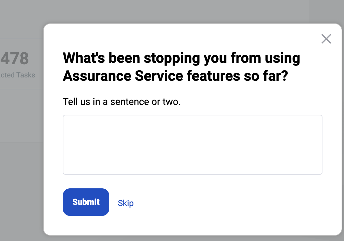
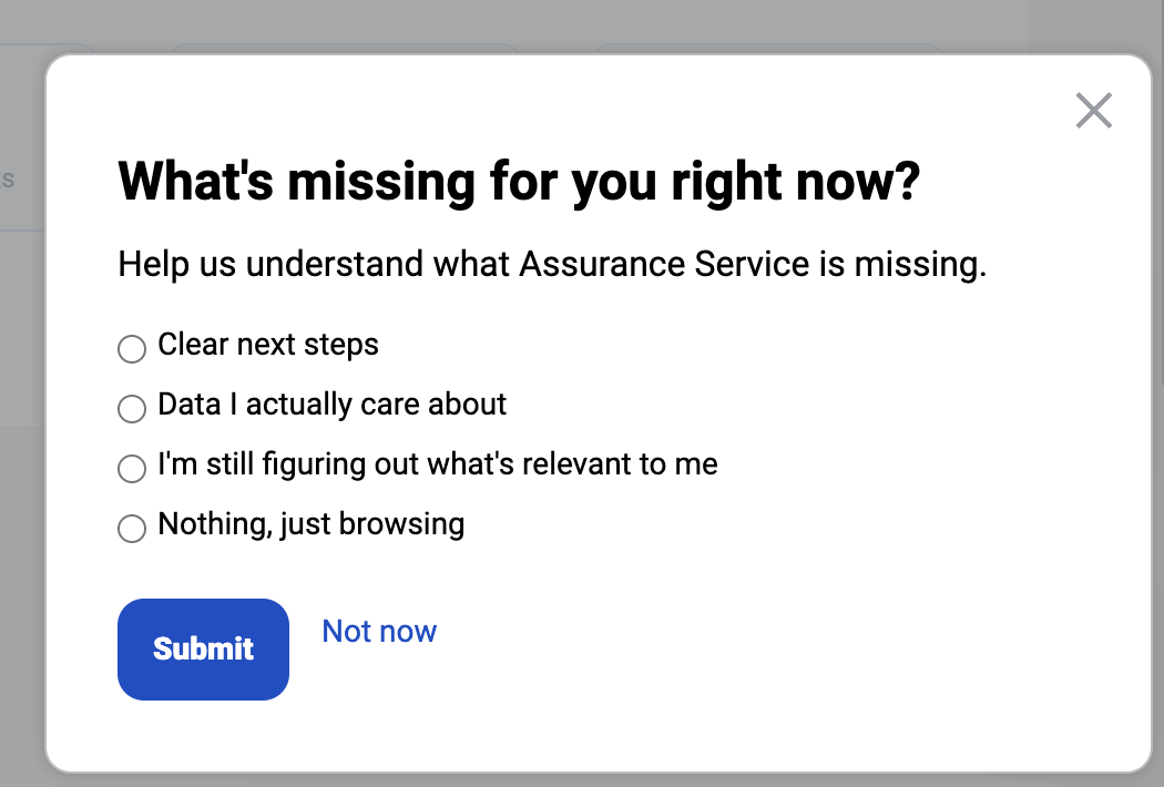
Built-in feedback: Along with UX, I created multiple in-app surveys to learn why users hold back, for example "What's missing for you right now?"
Feedback & Iteration
I worked through content review and testing with several teams, under changing scope and deadlines.
I worked with product management, UX, and QA, and resolved QA issues before launch.
I kept the work moving through shifting scope and tight deadlines, including reviewer absences, and carried most of the build.
Outcome (preliminary results, first few weeks)
Six guides are live. UX's preliminary data covers only some of them so far, and it shows users opening the menu, exploring guides, and adopting features. We're still collecting data because the release is recent, and I'll update this piece as results come in.
The Onboarding Assistant menu recorded 2,657 views from 384 unique visitors.
Among the guides tracked so far, Log Analyzer drew 2,104 views from 242 unique visitors, Health Check 398 from 65, and Custom Components 200 from 19.
Adoption rose across all three tracked features between Aug 31 and Sept 22, including from new accounts. Gains were modest:
Log Analyzer: 14.01% to 14.52% of accounts
Custom Components: 11.40% to 11.61%
Health Check: 49.19% to 49.35%
Aside: Pre-release announcements
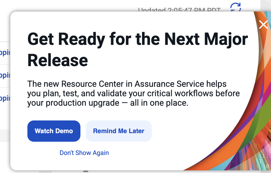
To support the same releases, I also wrote in-app pre-release announcements, such as "Get Ready for the Next Major Release". They built awareness ahead of launch, reaching about 24.5k users across roughly 116k views, and the Onboarding Assistant then taught users how to use the new features.