
Content Architecture: Designing an Interactive "What’s New" Wayfinding Menu for Informatica Documentation
Overview
Informatica’s Online Help ecosystem requires users to quickly discover newly released features without getting bogged down in legacy text. Previously, updates were published as unstructured, long-form articles that forced users to scroll endlessly through dense pages to find what was relevant to them.
I led the content strategy and accessibility architecture for an interactive "What’s New" button-driven wayfinding menu. By replacing passive text links with a componentized, in-page anchor navigation directory, I drastically amplified information scent (giving users clear, immediate cues about where each link points) while completely eliminating vertical scrolling fatigue. The final system maintains strict layout stability during global translation and ensures absolute compliance with assistive technologies.
Problem
Informatica’s online help system relied on long, text-heavy pages that were difficult to navigate. By auditing the existing UI and content structure, I identified four primary friction points:
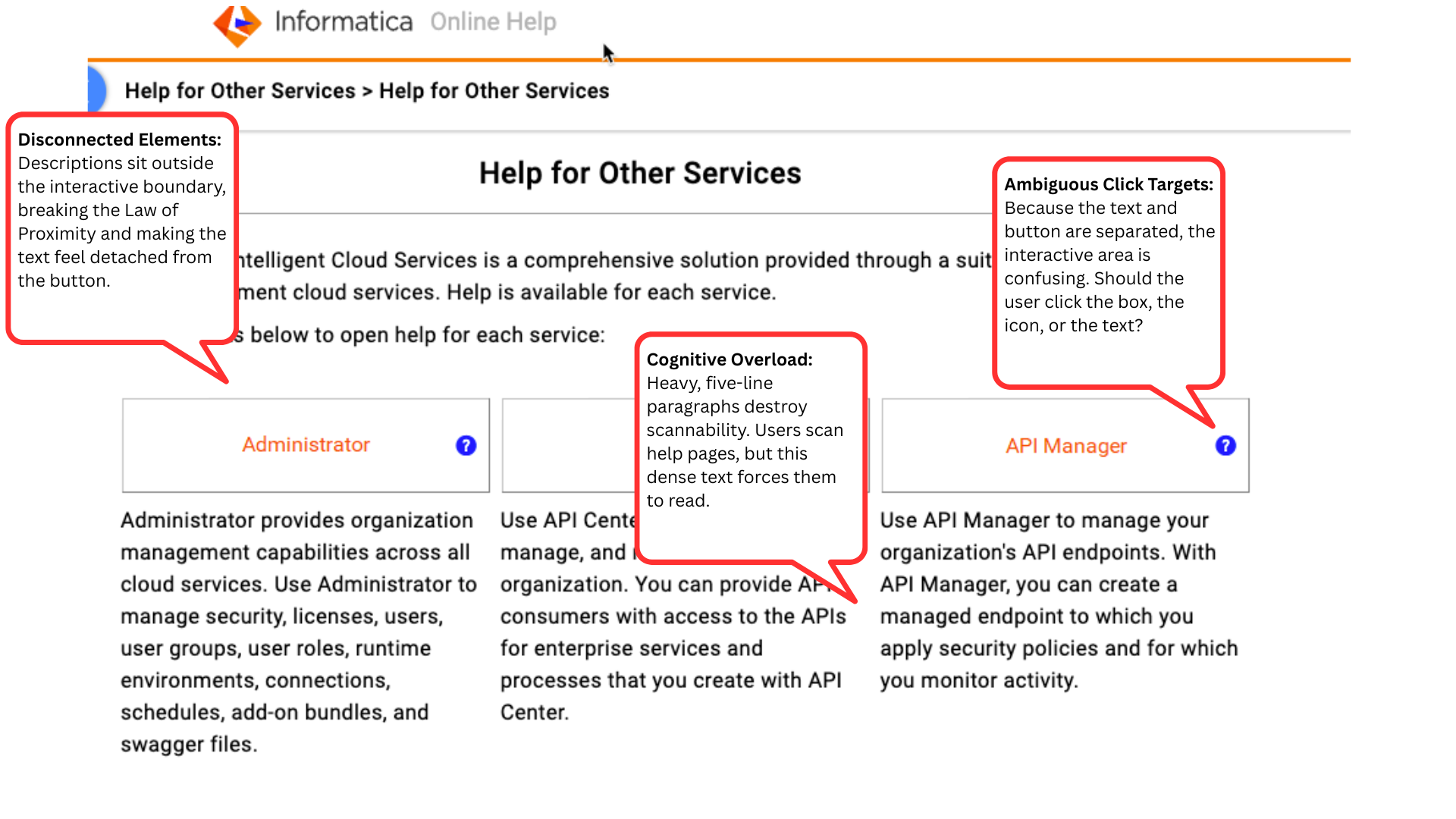
Cognitive overload & poor visual hierarchy: Lengthy pages and dense, five-line explanatory paragraphs lacked visual hierarchy, causing natural F-pattern scanning behaviors to fail. The massive blocks of static text dwarfed the actual buttons, forcing users to read rather than scan.
Ambiguous click targets: The previous UI separated the button titles from their descriptive text, violating the Law of Proximity. This created a disjointed experience where users were unsure whether the interactive area was the box, the icon, or the detached text block.
Localization UI breakage: Inconsistent text lengths caused UI layout instability. When translated into languages with high text expansion, text would frequently overflow containers or break the responsive grid.
Accessibility gaps: The disjointed navigation structure lacked semantic clarity. Detached text and traditional links did not provide adequate, unified context for screen readers navigating via the Tab key.
Previous wayfinding menu
Goals
To optimize the wayfinding menu prior to deployment, I established three cross-functional benchmarks bounded by strict engineering constraints:
Deploy an in-page wayfinding menu: Build a responsive, button-driven control layout that allows users to instantly toggle content states without forcing a full page reload or page jump.
Enforce string length constraints: Establish strict character-count limits for button states to naturally accommodate multilingual translation without triggering layout shifts.
Verify inclusive semantic architecture: Achieve absolute compliance with WCAG 2.2 AA standards across screen readers and keyboard-only navigation.
Solution
I translated technical requirements into a component-driven content schema, ensuring that text functioned as a predictable, interactive layout asset.
Tokenized label boundaries: I established strict character-count maximums for the interactive button elements. This structural constraint guaranteed that localized text nested uniformly within UI paddings, preventing layout breaks across all viewport breaks.
Semantic context layers: I engineered explicit, invisible context layers into the system by authoring dynamic aria-controls and aria-label strings. This provided screen-reader users with precise destination clarity as they tabbed through the menu options.
Authoring governance integration: To ensure system adoption, I structured these content constraints natively within the Oxygen XML authoring environment, deploying standardized DITA templates that automated length validation for technical writers.
Feedback & Iteration
Through collaborative QA testing with UX, Accessibility, and Localization leads, I refined the system to withstand extreme production environments:
I shifted the navigation model from passive text links to an active button array. I anchored each menu option with a concise, noun-based title (e.g., "Discovery Agent") paired with a benefit-driven, click-to-reveal microcopy string (e.g., "Find trusted, compliant data assets faster"), streamlining visual parsing speeds.
I validated the menu layout against the longest predicted localization strings. By enforcing vertical flexbox rules and testing localized text blocks, I ensured the menu grid preserved uniform button alignments regardless of language-specific text volume.
I audited the tab order and focus indicators across the interactive grid. This guaranteed that the visual focus state mapped seamlessly to the underlying semantic content path when a user clicked or pressed space to toggle content.
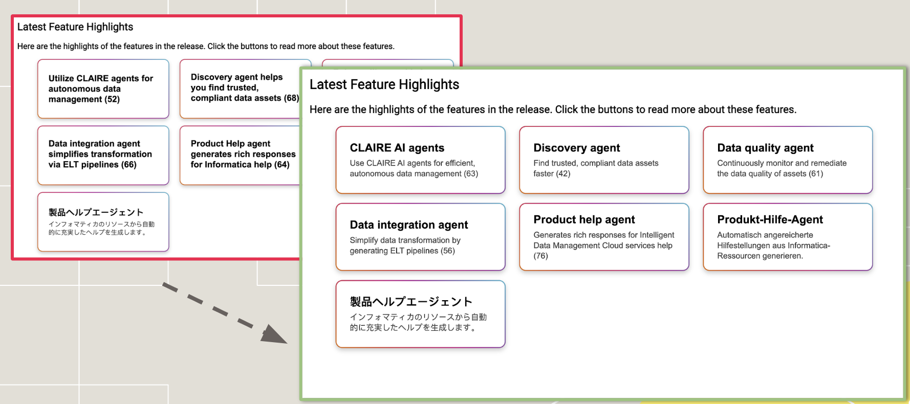
An example of how the button menus look across different layouts and languages.
Outcome & Next Steps
To ensure the new wayfinding menu scaled across Informatica’s enterprise footprint, I drove three long-term governance initiatives:
UX writing style guide deployment: I established clear guardrails for component copy length, tone of voice, and accessibility patterns for future “What’s New” releases.
Enterprise enablement: Formulated step-by-step XML workflow templates and launched an internal training series at the Documentation All-Hands meeting to accelerate content adoption.
Validation framework: Partnered with Product Management to track qualitative feedback within the help platform. Early post-launch customer interviews match our design hypotheses, signaling a noticeable decrease in user time-on-task and a marked improvement in self-service navigation efficiency.