
Structuring Technical Content: A Card-Based Wayfinding System for Informatica
Overview
I led the content strategy and accessibility integration for a new interactive navigation system within Informatica’s Online Help. By introducing context-rich feature tiles, I transformed dense, static documentation into a guided wayfinding experience. My focus was on creating a UI pattern that increased information scent (giving users clear cues about where a link leads) while maintaining strict layout stability for global translation and full accessibility compliance.
The Problem
Informatica’s online help system relied on long, text-heavy pages that were difficult to navigate. By auditing the existing UI and content structure, I identified four primary friction points:
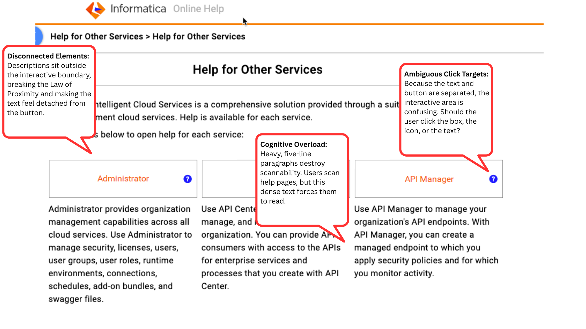
Cognitive overload & poor visual hierarchy: Lengthy pages and dense, five-line explanatory paragraphs lacked visual hierarchy, causing natural F-pattern scanning behaviors to fail. The massive blocks of static text dwarfed the actual buttons, forcing users to read rather than scan.
Ambiguous click targets: The previous UI separated the button titles from their descriptive text, violating the Law of Proximity. This created a disjointed experience where users were unsure whether the interactive area was the box, the icon, or the detached text block.
Localization UI breakage: Inconsistent text lengths caused UI layout instability. When translated into languages with high text expansion, text would frequently overflow containers or break the responsive grid.
Accessibility gaps: The disjointed navigation structure lacked semantic clarity. Detached text and traditional links did not provide adequate, unified context for screen readers navigating via the Tab key.
Goals
To address these challenges, the project aimed to:
Improve wayfinding: Design interactive, context-rich feature cards that guide users intuitively to new product updates.
Standardize UI constraints: Enforce strict copy length and structure guidelines to support seamless multilingual translation without breaking the UI components.
Ensure inclusive design: Achieve full accessibility compliance across all assistive technologies.
Approach & Strategy
I collaborated closely with Documentation, Engineering, UX, and Localization teams to ensure the solution was scalable, maintainable, and user-centric.
Component-driven copy: Defined strict character limits for both the card titles and the descriptive subcopy to ensure the text fit uniformly within the established UI paddings across all viewport sizes.
Accessible content architecture: Authored contextual ARIA labels (e.g., aria-label="Read more about the Discovery agent feature") to provide descriptive, invisible copy for screen-reader users.
Cross-functional governance: Structured the solution within Oxygen XML to minimize authoring complexity, ensuring technical writers could easily adopt the new format using standardized templates.
Feedback & Iteration
Through iterative reviews with Localization, Documentation, and UX teams, I refined the design to balance brand tone with UI constraints.
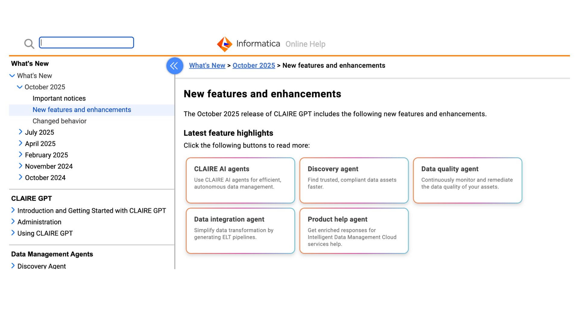
Content hierarchy & scannability: As seen in image_1a9c42.jpg, I shifted the navigation experience from passive, inline hyperlinks to a structured card layout. I established a clear content hierarchy by pairing concise, noun-based titles (e.g., "Discovery agent") with benefit-driven subcopy (e.g., "Find trusted, compliant data assets faster."). This drastically improved visual scannability.
Stress-testing the layout: I worked with Localization to test the longest translated strings, ensuring the card UI could accommodate standard text expansion without forcing unequal card heights or breaking the CSS flexbox layout.
Accessibility validation: Enhanced compliance through rigorous QA testing, ensuring focus states and keyboard navigation aligned logically as users tabbed through the grid of features.
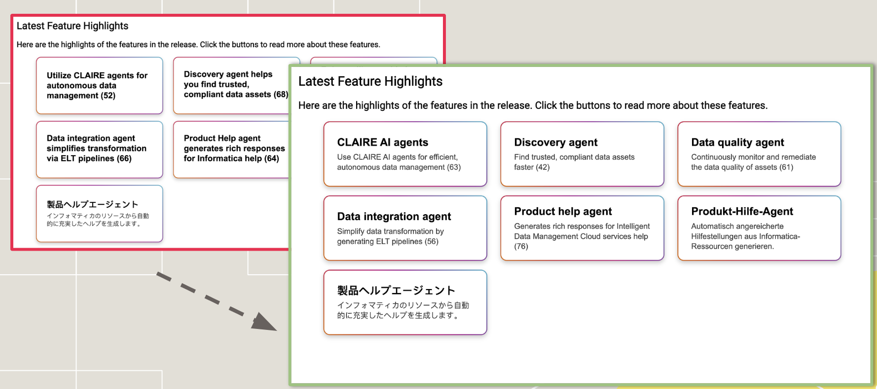
An example of how the button menus look across different layouts and languages.
Next Steps & Sustainability
To ensure the new navigation system scaled effectively across the organization, I drove the following governance initiatives:
Documentation design system: Developed a detailed UX Writing Style Guide for future releases and trained technical writers on standardized XML templates.
Internal enablement: Created supporting workflow guides and presented the solution at the Documentation All-Hands to drive internal adoption.
Post-launch measurement: Conducted post-release user research (customer interviews) alongside Product Management. The data confirmed that the new content design significantly improved navigation efficiency and reduced time-on-task.